snooze a.m. eatery

NOV - DEC 2024
4 WEEKS
SOLO PROJECT
THE CLIENT
Snooze A.M. Eatery is a vibrant breakfast and brunch restaurant known for its playful atmosphere, creative menu, and community-focused approach. Specializing in reimagined breakfast classics with a modern twist, Snooze combines bold flavors with sustainable practices, creating a dining experience that’s both fun and socially conscious. Its signature retro-inspired design and welcoming environment invite guests to connect over thoughtfully crafted meals that celebrate the joy of mornings.
THE PROBLEM
Snooze A.M. Eatery’s existing menu lacked organization, readability, and had grouping issues making it less intuitive for its primary audience of college students and families to navigate.
This project reorganizes the menu and table-topper with clearer groupings, modernized design elements, and improved readability while introducing a scalable, refreshed logo to create a more intuitive and engaging experience for Snooze’s diverse audience.
Research
To ensure a user-centered and functional design, I conducted a variety of research methods that shaped the final outcome. The AEIOU framework (Activities, Environment, Interactions, Objects, Users) helped me analyze Snooze’s environment, activities, and interactions, offering valuable insights into how customers and staff use the space and menus. This clarified the brand’s playful yet practical identity and the needs of its users.
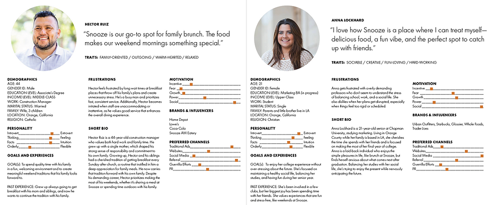
Personas, part of my user research, were mapped based on primary audience demographics—college students and families—to better understand their preferences and behaviors. This helped guide decisions about layout and grouping to make the menu more intuitive and relevant.
Accessibility research, including an analysis of ADA standards, highlighted the need for increased text sizes and color contrast, to improve readability, ensuring inclusivity for all (whether it be children learning to read, or people with visual impairments). Tactic research involved studying menus from various cuisines worldwide to identify trends in layout and design, offering inspiration for both aesthetics and functionality. Style research complemented this by exploring vintage diner motifs, contemporary typographic solutions, and bold color palettes that modernize nostalgia.


IDEATION
The ideation phase began with thumbnail sketches, where I explored initial concepts for the new logo and menu layouts. These quick iterations helped me brainstorm a range of possibilities before narrowing down my ideas. To refine the direction further, I created mood boards and font pairings that captured the playful, nostalgic aesthetic of vintage diners while staying true to Snooze’s vibrant and trendy identity.


After consulting other designers and revisiting my personas (particularly Hector), I chose the strongest concept. Given that I needed to prioritize readability for families, I figured that menu layout #7 would work well. So, I moved to comprehensive sketches, focusing not only on the menu but also on the corresponding table topper, allowing me to visualize how the elements would work together cohesively. A major focus of this stage was creating a more spacious menu layout, addressing the cramped and hard-to-read designs in the existing menu. I also began on the table-topper.
Design

The final design for the Snooze A.M. Eatery menu and table topper captures the brand’s playful, approachable personality while incorporating a fresh, modern aesthetic. The vibrant color palette seamlessly blends Snooze’s signature orange with bright, saturated hues, staying true to its diner heritage while injecting energy and warmth into the dining experience.
Two rounds of test prints were conducted with feedback from fellow designers. These iterations resulted in adjustments to spacing, alignment, and visual balance, leading to improved readability and an overall more cohesive layout. These changes ensure the design appeals to users while aligning with Snooze’s playful brand identity.
Typography choices are key to balancing nostalgia and functionality. Display typefaces like Balboa and Citrus Gothic evoke a vintage diner atmosphere, while adjustments such as increased tracking and centered inline styles enhance legibility. For body text, Roobert replaces Futura Condensed, offering a contemporary update while preserving the geometric character associated with the 1950s. This mix of typefaces ensures the design feels both inviting and easy to read.
Irregular shapes, inspired by classic diner signage, frame headings and key sections to draw attention while maintaining the menu’s retro-modern charm. Removing alcoholic beverages from the primary menu helped streamline the layout, making navigation more intuitive for guests. The updated sun-inspired logo is another standout feature, reinforcing Snooze’s emphasis on mornings, positivity, and sustainability. Its scalable design ensures high recognition across various applications, from menus to digital platforms.


IMPLEMENT
After conducting a survey with over 30 participants ranging in age from 18 to 55, insightful feedback was gathered regarding the redesigned menu and logo for Snooze A.M. Eatery. Results showed that 53% of respondents preferred the redesigned menu, with 60.1% finding it easier to read and better organized compared to the original. Feedback on the logo presented a more nuanced perspective. While 57.1% of participants preferred Snooze’s original logo as a whole, 64% favored the new logomark over the original “jack” icon. Furthermore, 78.6% of respondents highlighted the redesigned logomark’s superior scalability, particularly noting its improved clarity and effectiveness at smaller sizes.
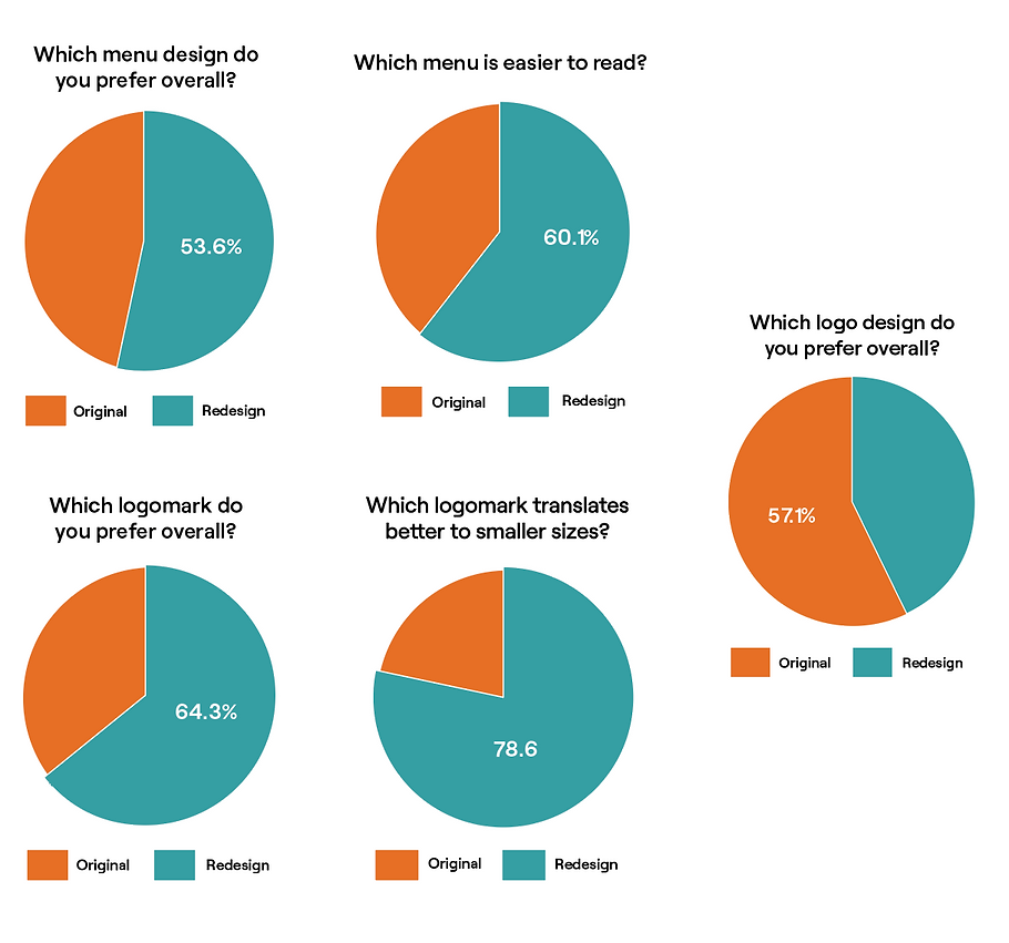
Qualitative data also offered valuable insights into potential areas for refinement. Many respondents appreciated the filled color boxes on the original menu, which effectively divided sections and enhanced usability. While the redesigned table topper retained this feature, its absence in the new menu was noted, suggesting an opportunity to reincorporate it to improve clarity and user experience. Additionally, feedback on the new logo typeface indicated a desire for a more refined and mature style that aligns with the modernity of the redesigned logomark. Incorporating these adjustments would not only address user preferences but also further enhance the cohesion and impact of the design.