redmond, wa

OCTOBER 2024
4 WEEKS
SOLO PROJECT
THE CLIENT
The City of Redmond, WA, is a thriving tech hub in the Pacific Northwest known for its innovative spirit, scenic parks, and vibrant community. As home to major tech companies such as Microsoft, and abundant outdoor attractions, Redmond blends modern industry with natural beauty, making it a dynamic place to live, work, and explore.
THE PROBLEM
The City of Redmond, WA, lacks a centralized, visually engaging platform to showcase its unique attractions, tech-forward identity, and community offerings. Without a cohesive digital presence, prospective residents and visitors may overlook Redmond’s potential as a travel and residential destination.
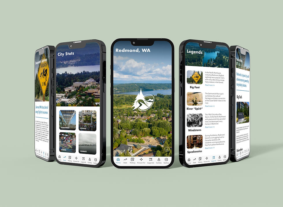
To address this, the project calls for the development of a mobile app that highlights Redmond’s attractions, history, and community offerings through a modern, tech-forward design, while integrating the existing logo.
Research & planning
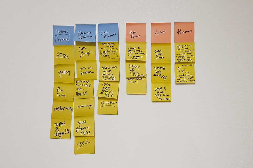
To begin the project, I conducted a small, individual sticky note ideation session to outline and sort the essential and "nice-to-have" features for the app. This method helped organize thoughts, identify key functions, and define initial user personas. By mapping out core features visually, I could better understand the app's potential structure and how users might engage with its content.
The app targets several key demographics: Millennials and Gen Zers drawn to digital tools and modern design, Gen X families interested in Redmond’s family-friendly amenities, and young professionals seeking career opportunities in the city’s tech industry. Outdoor enthusiasts are also a critical audience, given Redmond’s abundant parks and trails. Balancing Redmond’s identity as both a tech hub and a nature-rich destination became central to the app’s design. The app targets several key demographics: Millennials and Gen Zers drawn to digital tools and modern design, Gen X families interested in Redmond’s family-friendly amenities, and young professionals seeking career opportunities in the city’s tech industry. Outdoor enthusiasts are also a critical audience, given Redmond’s abundant parks and trails. Balancing Redmond’s identity as both a tech hub and a nature-rich destination became central to the app’s design.
Design
To begin the design process, I created loose wireframes in Figma to explore potential layouts and features for the app. This helped establish the app’s overall structure and visual flow.

I then shared these wireframes with individuals from my target demographics. Their feedback highlighted some navigation confusion and lengthy scrolling times. To address these concerns, I adjusted the layout by separating certain sections into distinct pages and refining the navigation structure.

After building out the initial comps, I conducted another round of user testing. Based on feedback, I replaced the circular design elements with shapes that framed the content more effectively, enhancing the overall usability and visual appeal. This iterative process allowed for a more intuitive and engaging app design.